

What it Means to be a UX-centric Tech Writer

I have been part of the information design and delivery field for nearly two decades now. In one form or another, I have been handling technical information, whether in software, government, or higher education for the better part of my career. It sure has changed quite a bit since I first mapped out my first website, I can attest to that.
To begin with, technical writers came along as the necessary bridge between subject matter experts and customers or consumers. In my original field of higher education (I taught at an R-1 University for quite a while), we worked on the notion that some people were suited for engineering, development, science, and so forth, and some people were suited to understand and explain it in laymen’s terms. For quite some time, passive voice and distanced-language was the norm.
A paradigm shift occurred when we all realized that technical manuals – installation guides, user documentation, and troubleshooting – were all far more palpable if we just wrote them the same way we would explain the processes themselves. Eureka! “Plain Language” was born. One of the leaders in the charge was teacher and scholar Erwin Steinberg. Steinberg championed many advances in technical and professional writing, and moved the needle considerably in conciseness and clarity. (And yes, indeed, Carnegie Mellon is both where I studied and where I taught, so to say I am an acolyte is an understatement.) Steinberg’s text, written along with William Schutte, “Communication in Business and Industry” is arguably almost as relevant today as it was when it was published more than fifty years ago.
What has changed in the years since that first technical writing undergraduate major was launched is the centricity of the way we write technical text. When technical writing fully hit its stride, not long after the personal computer and internet became a true staple of both home and work, the locus of technical writing shifted from the technical user to the everyday user.
Specializations emerged that are now necessary to our function in everyday business that were unforeseeable before. UX and Instructional designers now must envision and create personas for the users in their fields, and imagine who is on the other side, who is consuming their creations and not just how, but why.
Just as automobile designers, fashion designers, and creators of every type in every field, now those of us at keyboards in the technical realm turned to think of our end users not as savvy experts, but as new consumers with specific desires and needs that must be filled, or who would move on to companies with products that could give them what they want at breakneck speed.
In the early 1990s, a hastily written user guide could balloon into the hundreds of pages if we weren’t careful, and little thought was given to the overall design.
Now that we tend to write by working in an Agile environment, more on board with the development team from the start, and with more input in the scope, we can bring a design thinking mentality to the process. The difference between writing and end-to-end manual and wireframing a useful knowledge base website is vast – and fun!
Thinking like a strict technical writer, we might cover every detail, from turning on the machine to creating and logging in with user credentials, to an entire step-by-step process that users are now wholly familiar with.
Thinking like a UX writer, though, we can liberate ourselves from much of that clutter by recognizing that our clientele know full well how to turn on their machines, they understand what it means to log in, they don’t need words like “navigate,” “click” or “enter.” Those are all useless fluff the same way that passive voice once was. The sooner we move on, the better.
As a strict tech writer, I found that rarely did my colleagues engage in discussions with customers about how to improve or streamline their documentation. I got feedback from peers that were mortified at the thought of interacting with their users. But in a UX writing environment, it’s informative and enjoyable to gather feedback from how our users actually apply our work. Knowing what works, and what doesn’t, what is exciting and what fails, helps to create better and better documentation.
In the new formats we are applying, UX writers often have limited information bandwidth, since many of us work on apps and app messaging. A UX writer could realistically have to craft a message that uses:
- A 30 Character Headline
- A 45 Character Body
- 25 Character Buttons or Tags
With these limitations, UX technical writers must be concise, thoughtful, and creative to get the job done and done well. We have to consider user-types, roles, and information delivery in microcopy without losing messaging.
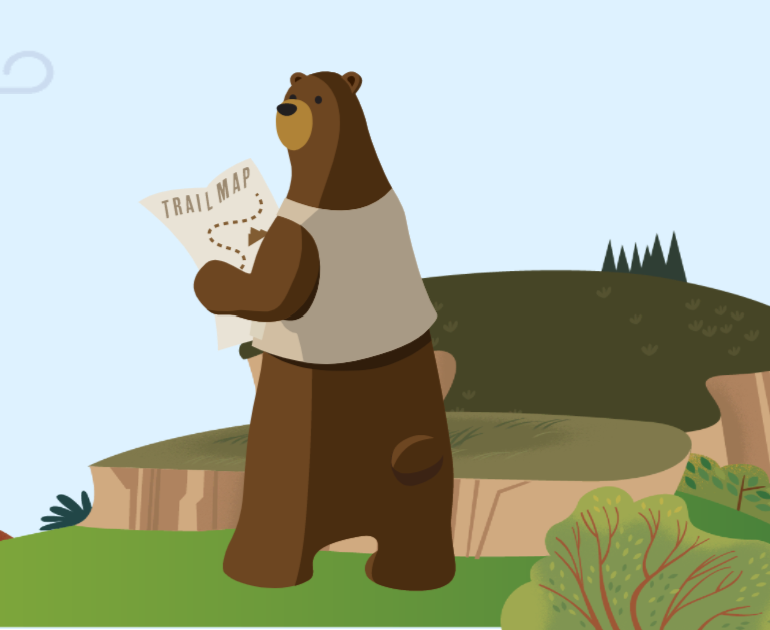
This is, in part, why companies like SalesForce have turned to humor in their technical copy. There’s little room for elaborate text, so having a bit of fun with graphics or pop-ups along the way eases the tension. Take, for example, the cute little bear they use on their learning platform. Not exactly a serious guy.
If you’re interested in upskilling a bit when it comes to Microcopy, a skill that is fairly essential in a technical UX sense, Udemy has an excellent short course. Surely other providers will follow, but so far this is my preferred resource. (Note: I get no reward, it’s just that I have found Udemy to provide good content in this area thus far. Please leave a comment if you have found other useful tools.)
Any of us who fancy ourselves “Content Strategists,” “Content Designers,” or just user advocates when it comes to text and information delivery will be coming up short if we fail to consider UX a vital part of what we do.
Long gone are the days when we must write a soup-to-nuts technical manual. Gone are the users who do not understand how to log in, how to set up credentials, how to read a page, navigate through menus, and so on. Solid research tells us that toddlers are capable users of iPads and cell phone screens. Today’s teens have no notion of what a rotary dial phone is or could be used for, and little idea of the purpose of a cassette tape, but are fully versed in the multitude of Snapchat filters and can adapt to a new iOS software update with no information in under 24 hours.
That, my friends, is our audience. A thousand-page manual is useless, but a thoughtful troubleshooting guide is golden.
Think about who is on the other side of the screen, what troubles they may encounter, and solve them. IF the interface is well-done, the documentation can (and should) be minimal. The help should be robust, and the instructions few. Provide a backup plan for pain points, and explanations for tricky areas, remembering that the tricky areas spotlight poor design. If we write as UX advocates, we will never be out of work, because our designers will help us design better, and there will always be more users for our greater creativity.
